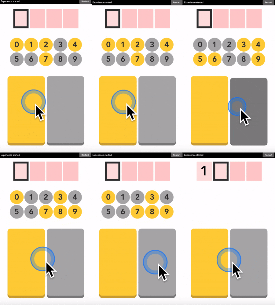
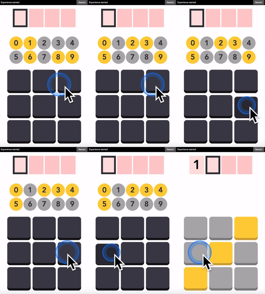
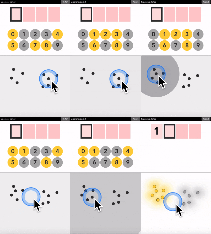
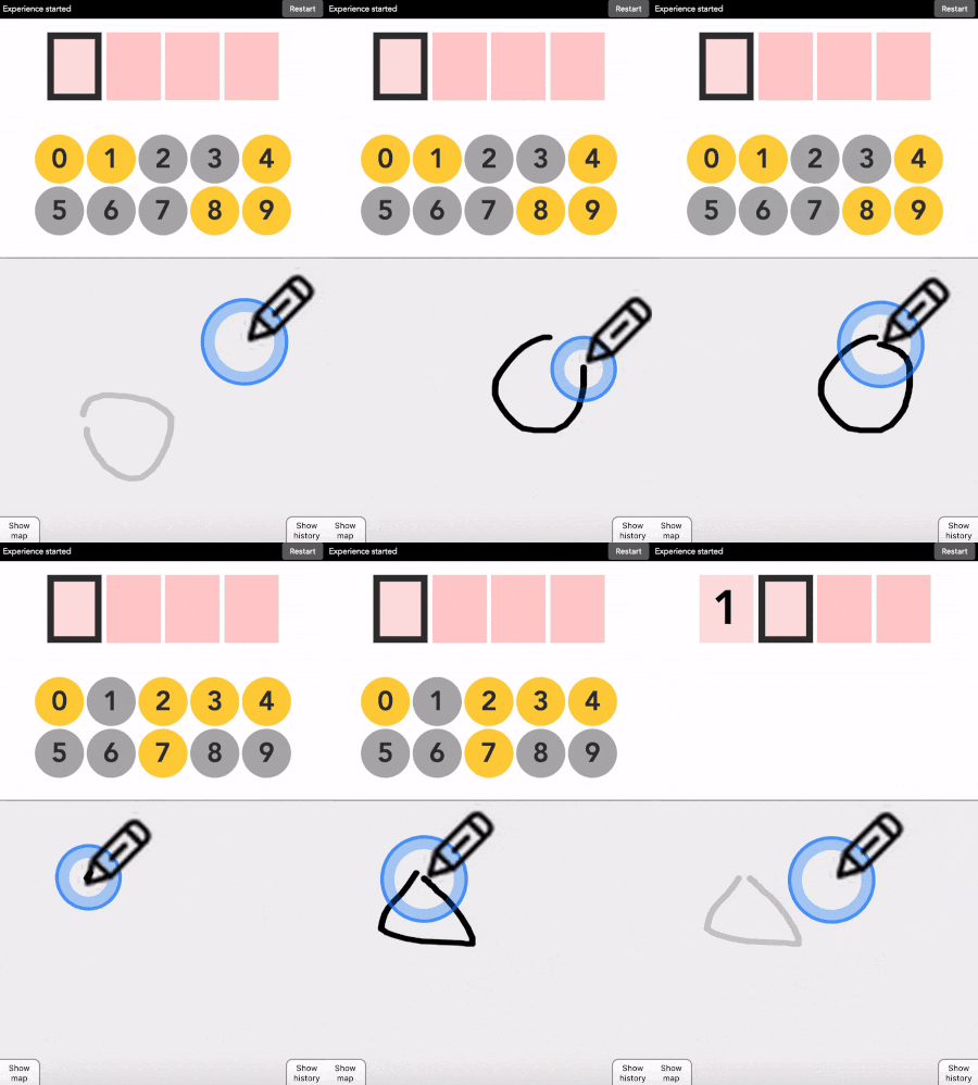
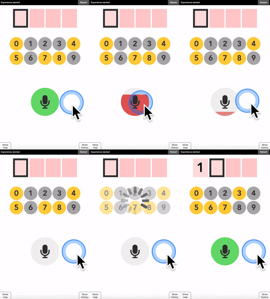
Jonathan Grizou · We are our choices
Demo - Keyboard
This demo will work best full screen at this link.
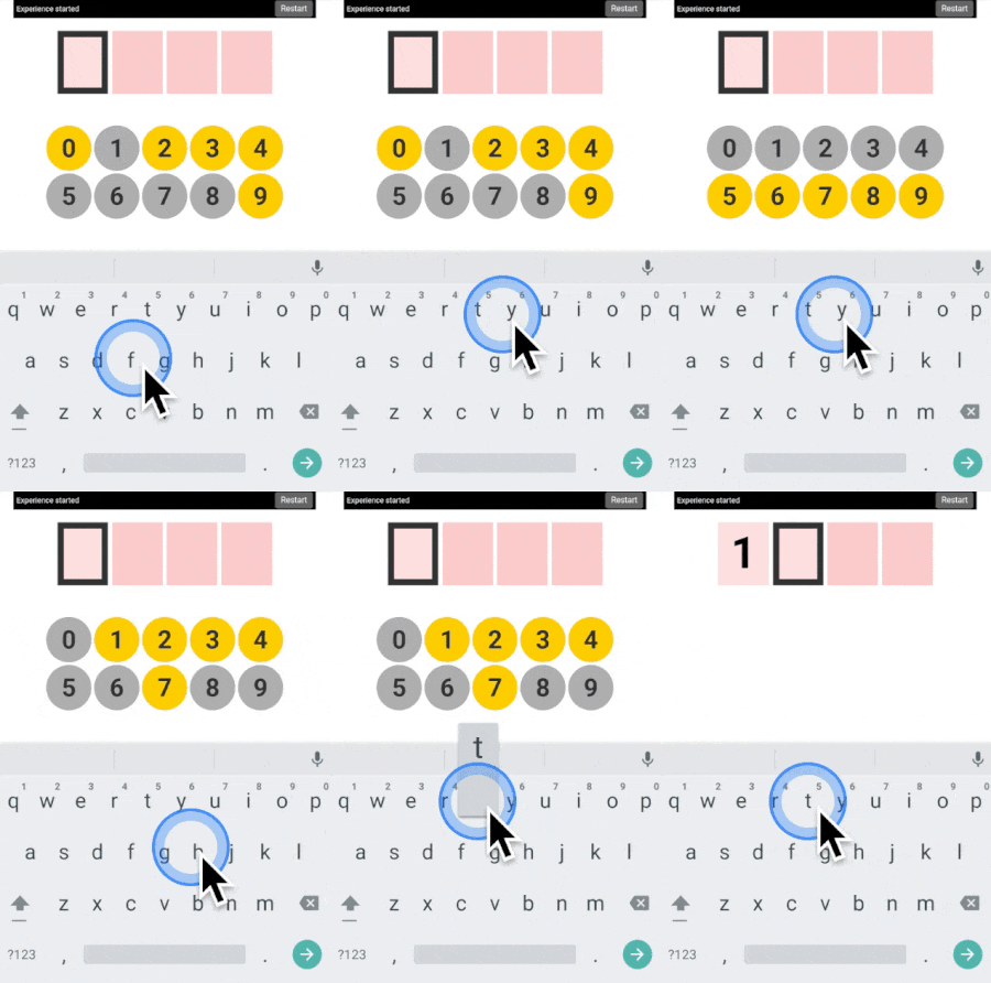
If you want to use the interface directly above, note that the interface needs to listen to your keyboard inputs which requires the focus to be on it. On desktop, clicking anywhere on the interface will bring the focus to it and keyboard events will be able to be recorded. As a visual feedback the keyboard drawing at the bottom of the interface will blink when a key is pressed. On mobile, an additional button will show up, clicking on it will both bring focus on the interface and force the keyboard to show.
How to use it
This is exactly like the 3x3 version, but you can use any key on your keyboard instead of the buttons. You choose which keys are meant to say yellow or grey.
It is meant to show the users’ actions do not have to be seen on the screen, making it harder for an outside observer to understand what code the user is typing.
More examples
Three additional demonstration videos are provided below ([1], [2], [3]). I am typing the code 1234 in each of them.
What’s next
Next, I recommend experimenting with the touch tutorial version. Try to fool it in predicting the wrong digit. Think of a color map that will be too hard for the machine to identify, and analyze why it fails.
All available versions are linked below.
Quick access: [Project page] [Crack it] [Try it] [Grasp it]
