Jonathan Grizou · We are our choices
Demo - Touch
You can access this demo full screen at this link.
How to use it
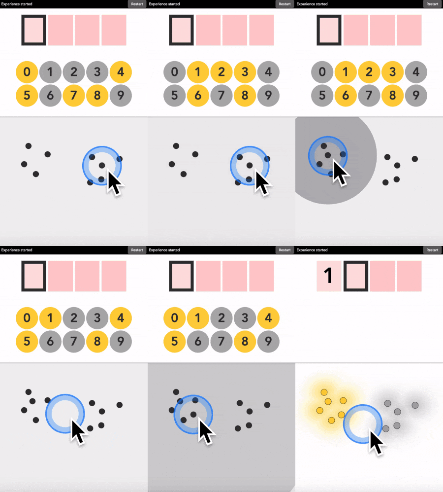
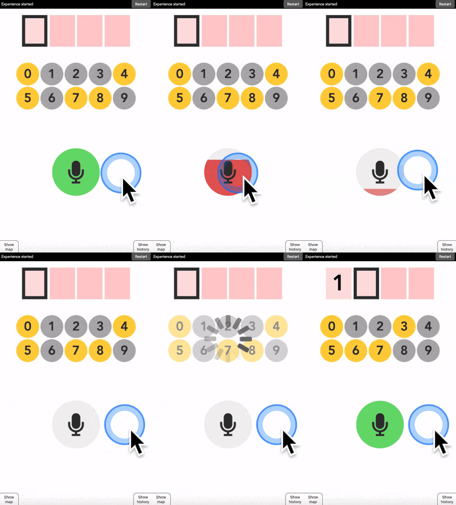
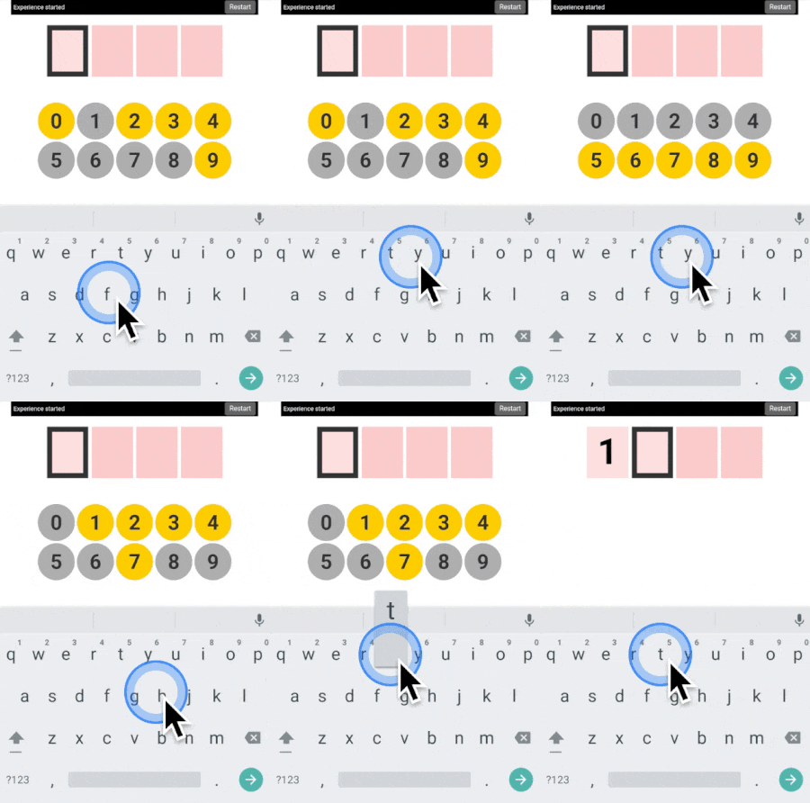
This is like the 3x3 version, but there is no buttons. Instead you decide on the geographic areas that are yellow or grey, and place points into those areas.
You can type any 4-digit code into this interface. The top part is where the code is shown. The middle part is the machine asking you what color the current digit you want to type is. And the pad below is how you answer back to the machine.
Let’s say your first digit is a 0. Look at 0. If it is yellow, click on a yellow area. If it is grey, click on a grey area.
“But there is no yellow or grey area?!?” I heard you say. Exactly so. The colored areas are in your mind, just decide where they are, stick with it, and the machine will understand it.
After each click, the machine will change the color of the digits. Simply repeat the procedure until the machine displays your digit, and the color of every points you placed! Repeat for the next digit until you have entered your full code.
More examples
Three additional demonstration videos are provided below ([1], [2], [3]). I am typing the code 1234 in each of them.
Seeing the color map
After each digit is found, the machine generates its own color map, which should approximate fairly accurately what you have in mind. You can visualize it online using this touch map version. The videos below ([1], [2], [3], [4], [5]) demonstrate it in practice.
Advanced discussion for curious minds
For readers accustomed to machine learning, the map is generated using a support vector classifier with a rbf kernel. But what is most interesting is that the first trained classifier can be refined as more digits are entered. In other words, we do not use the classifier to predict the color of the following points.
This is hard to explain concisely here, but you can see it on video 2 above. At 30s, a first map is shown, grey on the left, yellow on the right. Subsequent clicks are all in the yellow area. Nonetheless, when at 48s the map is recomputed, the top right part turns out to be grey. Which is indeed what I had in mind.
This is in sharp opposition with how user interfaces usually work. A classifier is trained first on labelled data, it is then frozen and trusted to infer user intent. In this work it is not the case, we remain flexible to changes, which makes our interface more robust to user preferences. More details on how this work in the explanatory tutorial.
What’s next
To go further, check the explanatory tutorial.
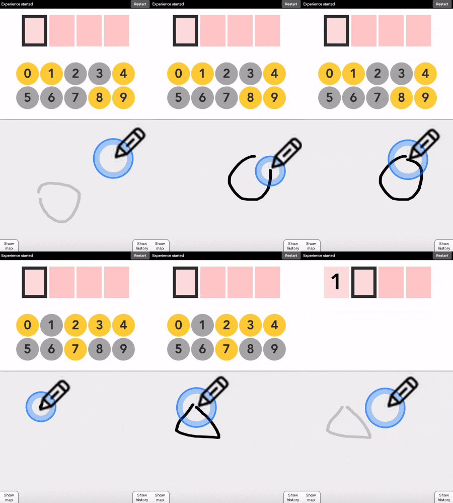
Next, I recommend trying the draw version, in which you draw sketches instead of placing points.
All available versions are linked below.
Quick access: [Project page] [Crack it] [Try it] [Grasp it]
